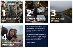
Flip Cards (Numbered)
Requirements This component is available in the Single column row on the Faculty and Department theme. Recommended Usage The Flip Card component displays a set of square images with a ‘flip’ animation on mouse hover. Each Flip Card is automatically numbered based on the order entered in the component editor. If you’d like to have numbers […]
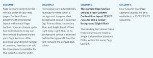
Standard Editor Component
Live example (all paragraphs of text on this page) Requirements The standard editor component is available on each of the column layout options on the Faculty and Department theme: Single column row Two column row Three column row Four column row Recommended Usage Used to display text, and sometimes images. Text can be hyperlinked, made […]
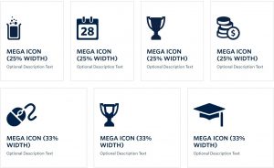
Mega Icons Component
Live example Requirements The Mega Icon component is available in the Single column row only on the Faculty and Department theme. Recommended Usage Mega Icons are large link target areas that consists of an icon image, title text, optional description text. Mega Icons can be made in sets of 1 (100% width), 2 (50/50), 3 […]

Featured Header(Video & Image)
Requirements This component is available only on the Home Page and Landing Page Templates within the Faculty and Department theme. UBCO ACF Component Restrictions plugin is deactivated. Recommended Usage A Featured Header Image or Video is a large banner image or video generally placed on the start of a web page that depicts an overview of the page’s content. Component Fields: Featured Header has a Header Type field to […]
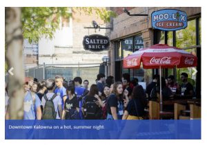
Image Slider
Recommended Usage Image Slider is used to display a carousel of pictures and their captions. Component Fields: Image slider has fields for selecting the slide picture and a text field for entering the caption. Interactivity: The slider has left and right arrows that will change the slides. How to add an Image Slider component Add […]