Live example (all paragraphs of text on this page)
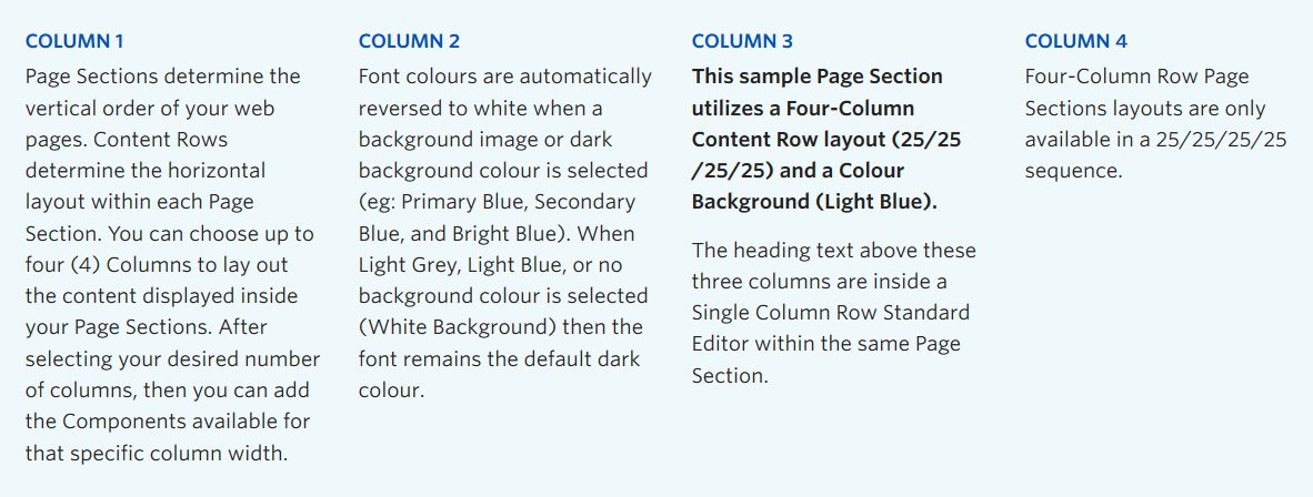
Screenshot showing four instances of the standard editor component in four columns
View live example on the Demo Site (all paragraphs of text on this page)
Requirements
The standard editor component is available on each of the column layout options on the Faculty and Department theme:
- Single column row
- Two column row
- Three column row
- Four column row
Recommended Usage
Used to display text, and sometimes images. Text can be hyperlinked, made bold, italicized, etc.
List of buttons on the visual tab of the standard editor:
- Paragraph Drop Down – This allows for the selection of different font sizes including headings and paragraphs
- B – Make text bold
- I – Make text italicized
- Block Quote – Applies special style to show a block quote. This is good for emphasizing a quote within a body of text.
- Bullet list -Add a bullet list of items
- Numbered list -Add a numbered list of items
- Left align – Used for text or image alignment.
- Center align – Used for text or image alignment.
- Right align – Used for text or image alignment.
- Create hyperlink – Add a link to text or an image. Click the little cog symbol for a full set of options, including page search, and open link in new window.
- Remove hyperlink – Removes a link from text or images.
- Undo – Undo last action within the standard editor.
- Redo – Redo the last action that was undone.
- Copy – Copy text
- Cut – Cut (remove)
- Paste – Paste text
- Decrease Indent – Move lists to the left
- Increase Indent – Move lists to the right
- Paste as Text -Use this option if you want to strip out any formatting, good for pasting from Word documents
- Clear Formatting – Use this button to clear formatting
- Insert Special Character – Use this to add special characters such as © or ¥, etc.
- Read More Tag – Use this for posts to add a “Read more” button
- Insert or Edit Table – Use this for html tables
- Horizontal Line – Add a horizontal line, good for giving definition to sections of content
- Anchor – Add an anchor link to jump to different sections of content of a page
- Nonbreaking Space – Add a nonbraking space, similar to a line return
- Keyboard Shortcuts – Shows which keyboard shortcuts are available in the standard editor
How to use this component
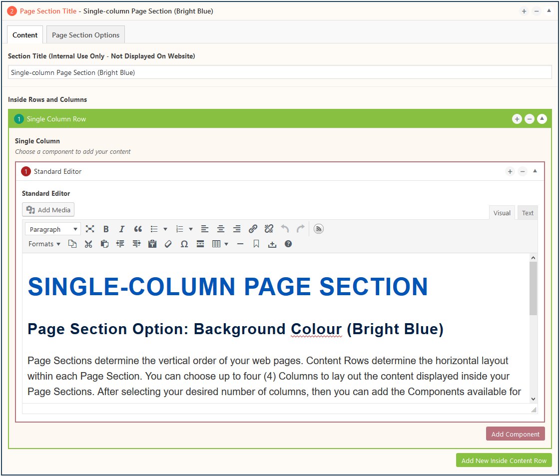
- Click the Add Component button inside any Content Row
- Add text or images and use the buttons to format your content
- Switch from Visual tab to Text tab to edit html code
Do’s and don’ts
Choose your use of columns wisely to maximize content readability. Single column text content is the most common way to display your paragraphs of text. Multiple paragraphs are a great way for grouping content of similar character length together with a bold title at the top of each paragraph. (See example screenshot above.)