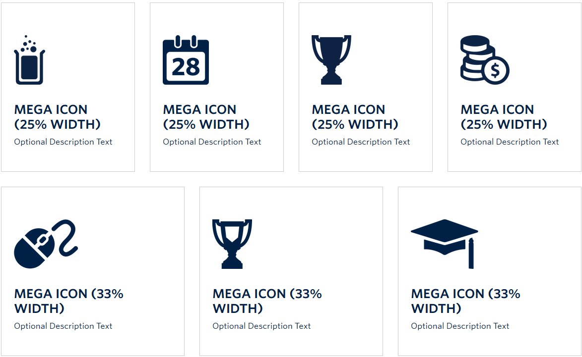
Screenshot showing example of Mega Icons – View live example on the Demo Site >
Requirements
The Mega Icon component is available in the Single column row only on the Faculty and Department theme.
Recommended Usage
Mega Icons are large link target areas that consists of an icon image, title text, optional description text. Mega Icons can be made in sets of 1 (100% width), 2 (50/50), 3 (33/33/33), or 4 (25/25/25/25) buttons across.
Icon images have a consistent height and should use the UBC Primary Blue. For custom icon designs, please inquire with University Relations.
How to use this component
- Add a single column row to a page section
- Click Add Component
- Click Mega Icons button
- Click Add Mega Icon button
- Choose or upload a transparent PNG icon
- Add Title Text, Description Text, and Link
- Choose the size of the icon. Important Note: each row should not exceed 100%
- For best results, choose row combinations that equal 100%, for instance 2 x 50%, or 3 x 33%, etc.
Do’s and don’ts
- BE CONCISE. As with most website related content, the phrase “Less is More” is important to keep in mind.
- Pay attention to character and word counts, try to be consistent throughout all Mega Icons.
- When using Mega Icons, pay close attention to the word count for your Titles and Description Text. Try to keep the titles short and keeping it to 1 line. If one of your titles is breaking to 2 lines long, make the others 2 lines as well or reduce it to 1 line. This same idea applies with the description text. Try to keep it to no more than 2-3 lines long and keep the lengths even. Otherwise, the boxes will show up with different heights.
- Much like the Mega Buttons Component, the ideal usage of this component is placement after the main content at the bottom of a page and on top of a default white background.
- Do not exceed 100% combined item width per row. For instance if you add 4 mega icons each with 33% width, that would exceed 100% total width.