How to add a table and apply the UBC CLF styles?
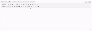
To create a table in the rich text editor, click the Table toolbar icon/item and choose the number of rows and columns you want on the table. Once the table is inserted, click on the Table, then click the Properties icon to bring up the Table Properties box. Choose a CLF Style from the Class drop-down. Optional […]
How to add a new item to Slider?
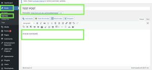
Requirements: This tutorial is an extend session to Slider and only applicable for sites with Slider Shortcode plugin activated. Instructions: Log in to your website – sitename.ok.ubc.ca/login/ Posts -> Add New Enter the title The description can go either in the Page/Post Editing Area or in the Excerpt Choose the Posts category; since the category […]
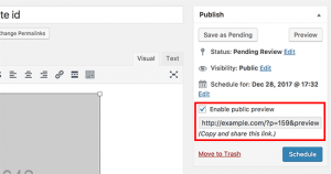
How do I share a page that is still in Draft?
Each unique URL lasts for a maximum of 30 days from the time of activation. After 30 days, the publicly shareable link will expire and you will need to generate a new link. Sometimes you may want to create a new page and share a preview of it with someone who does not have access […]
Adding Buttons Inside Content
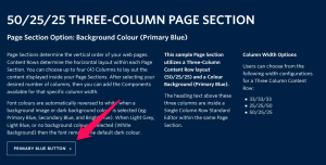
View live examples on the Demo Site > Requirements Buttons can be created within any Standard Editor component within the Faculty and Department theme. Recommended Usage Buttons are a common element in all websites. Use these to link to other pages within your site, or to other websites. How to use this component Highlight the […]

Embedded Media
Notes about Embedded Media Because embedded media refer to assets outside of your website, your item may load with a slight delay from the rest of the page. Additionally, if the vendor experiences a service outage, your embedded item(s) may also be affected. Some browsers may also restrict embedded media depending on user settings. Please test […]