Story Box Component
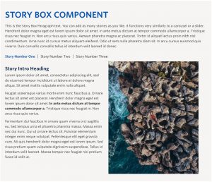
Live Example Requirements The Story Box component is available within a single column row on the Faculty and Department theme. Recommended Usage This is the Story Box Paragraph text. You can add as many stories as you like however we recommend a maximum of around four or five. It functions very similarly to a carousel […]
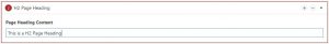
H2 Page Heading
Live example Requirements The H2 Page Heading component is available in the Single column row on the Faculty and Department theme. Recommended Usage Page heading or section heading used to introduce a section of content. How to use this component Add a single column row to a page section Click Add Component Click H2 […]
Tabs Component
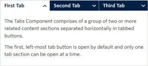
Live example Requirements The tabs component is available in each of the column layout options on the Faculty and Department theme: Single column row Two column row Recommended Usage The Tabs Component comprises of a group of two or more related content sections separated horizontally in tabbed buttons. The first, left-most tab button is open […]
Flip Cards (Basic)
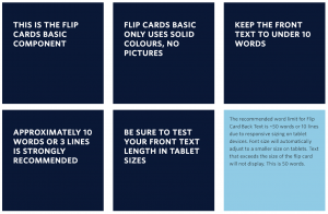
Requirements This component is available in the Single column row on the Faculty and Department theme. Recommended Usage The Flip Card Basic component displays a set of dark blue squares with a ‘flip’ animation on mouse hover. The backside of the card has a light blue background colour. Due to the size limit of the square cards […]
Flip Cards (Numbered)
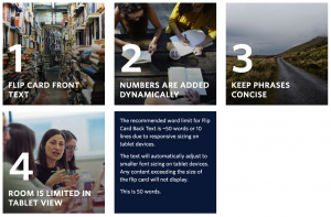
Requirements This component is available in the Single column row on the Faculty and Department theme. Recommended Usage The Flip Card component displays a set of square images with a ‘flip’ animation on mouse hover. Each Flip Card is automatically numbered based on the order entered in the component editor. If you’d like to have numbers […]