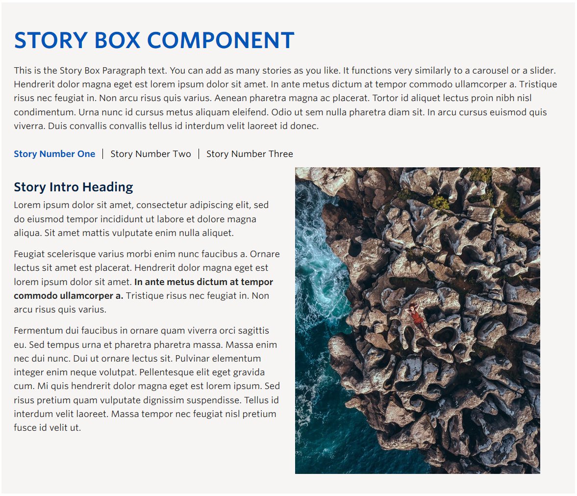
Screenshot Showing Story Box Component – View live example on the Demo Site >
Requirements
The Story Box component is available within a single column row on the Faculty and Department theme.
Recommended Usage
This is the Story Box Paragraph text. You can add as many stories as you like however we recommend a maximum of around four or five. It functions very similarly to a carousel or a slider.
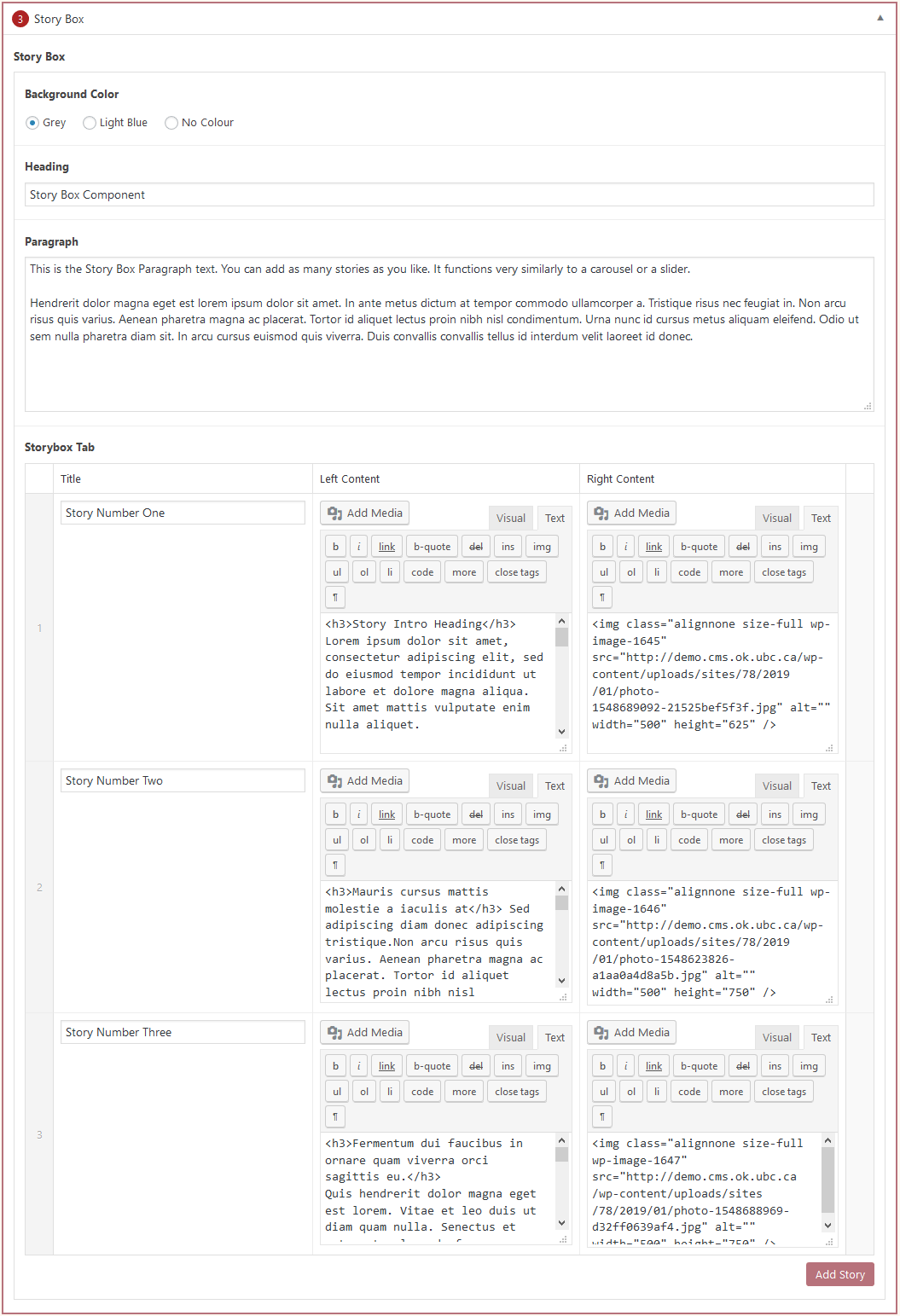
How to use this component
- Add a single column row to a page section
- Click Add Component
- Click Story Box button
- Choose desired colour option (Grey, Light Blue, No Colour)
- Add Heading text
- Add Paragraph text
- Click the Add Story button
- Add a story title, left content, and right content
- Repeat these steps to add additional stories
- Re-order the stories by dragging and dropping each item to your desired order. Hover over the numbered grey bar on the far left to click and drag each item up or down.
- Click Preview to often to test your Story Box. Make edits as necessary.
- Publish/Update when ready to go live.
Do’s and don’ts
BE CONCISE. As with most website related content, the phrase “Less is More” is important to keep in mind.
Be sure to size your text and images to be similar length and shape for each of the left and right content areas. Try to match the word count to the size of the image if you use an image.
Don’t add too many stories that the story navigation wraps to a second line.