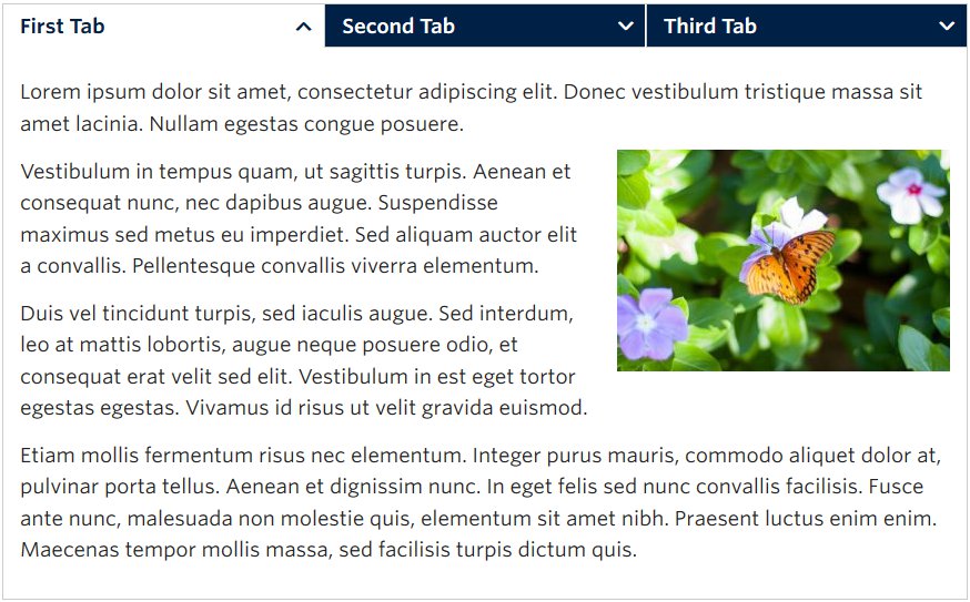
Screenshot Showing the Tabs Component with Three Tabs – View live example on the Demo Site >
Requirements
The tabs component is available in each of the column layout options on the Faculty and Department theme:
- Single column row
- Two column row
Recommended Usage
The Tabs Component comprises of a group of two or more related content sections separated horizontally in tabbed buttons.
The first, left-most tab button is open by default and only one tab section can be open at a time.
How to use this component
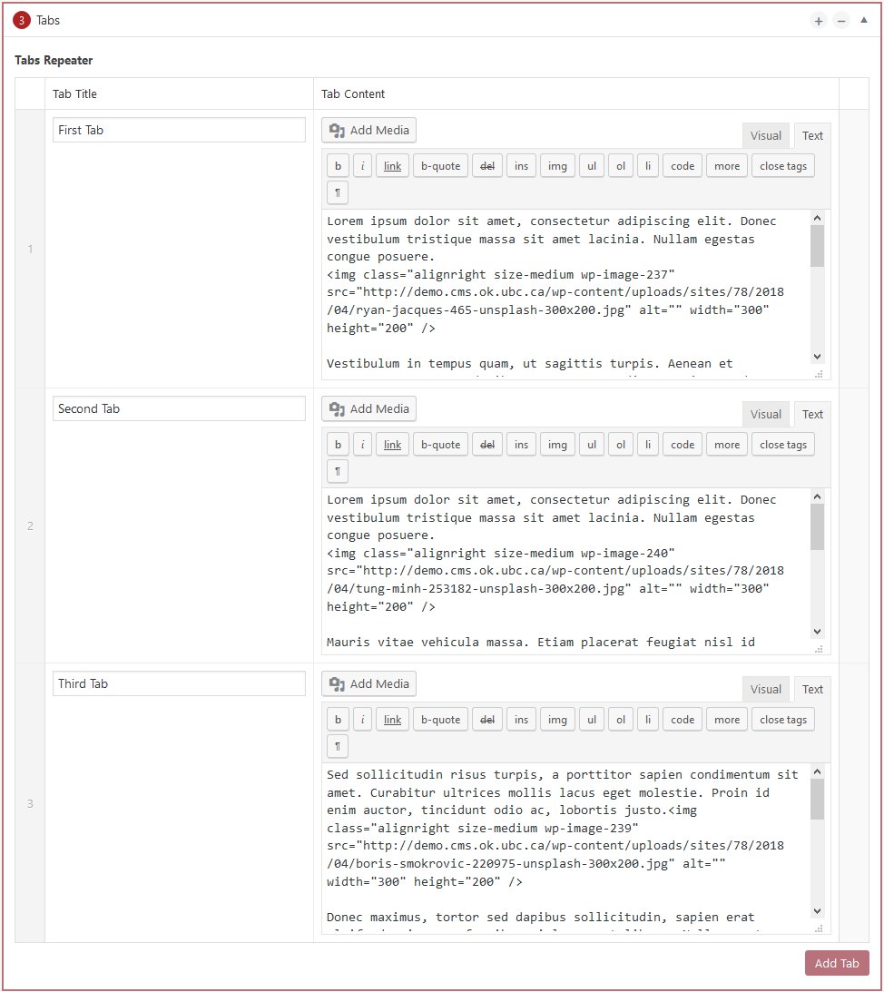
- Add a single column row or a two column row to a page section
- Click Add Component
- Click Tabs
- Click Add Tabs for as many tabs as you want to display, minimum is two tabs, maximum is four.
- Add a title and add content for each of the tabs
- Click Preview to often. Make edits as necessary.
- Publish/Update when ready to go live.
Do’s and don’ts
BE CONCISE. As with most website related content, the phrase “Less is More” is important to keep in mind.
Use the tabs component to group similar types of information together.
Don’t put a lot of text into the title of each tab, this could cause the words to wrap to two or three lines and that looks very bad.
IMPORTANT: Don’t put a single sentence inside each tab. Very small amount of grouped information is better displayed without asking the user to click to view the information.