Flip Cards Basic Example. View in live Demo site >
Requirements
This component is available in the Single column row on the Faculty and Department theme.
Recommended Usage
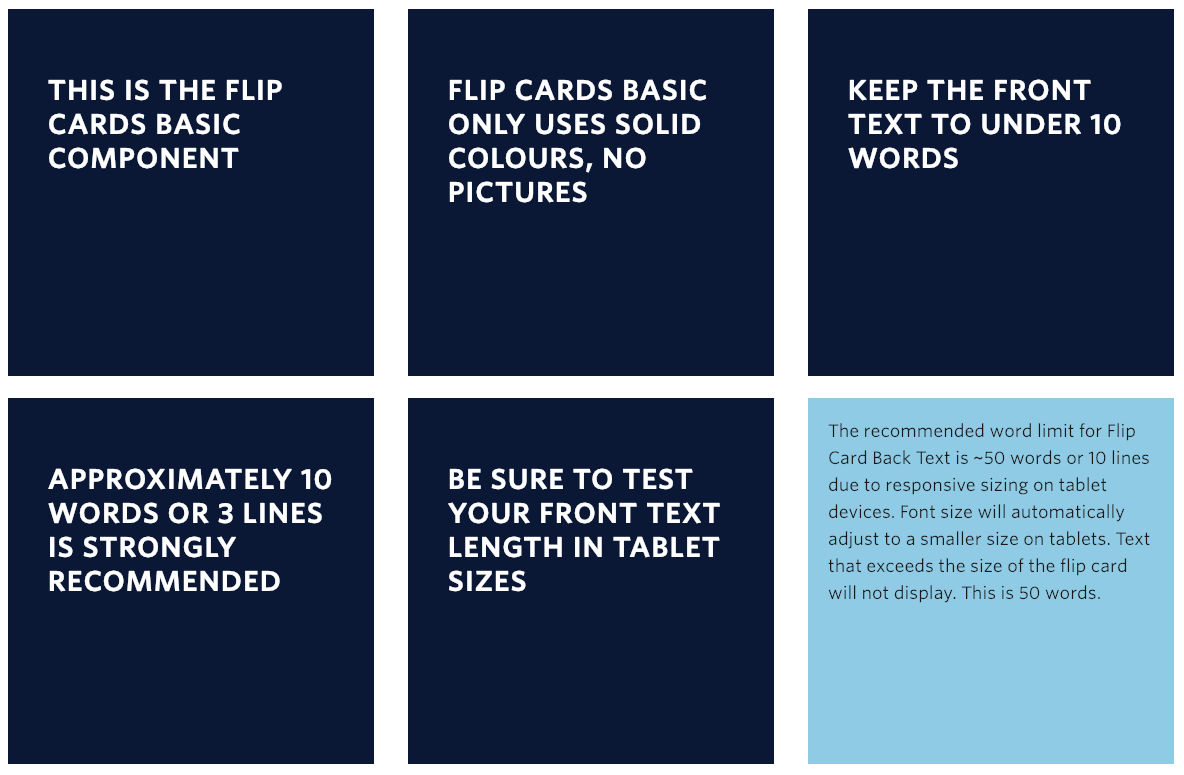
The Flip Card Basic component displays a set of dark blue squares with a ‘flip’ animation on mouse hover. The backside of the card has a light blue background colour.
Due to the size limit of the square cards on tablet devices, it is very important to keep the frontside text headline and the backside text short and concise. Cards are a fixed size and any content exceeding the size of the flip card will be cut off. The recommended word limit for Flip Card Basic Back Text is ~50 words or 10 lines.
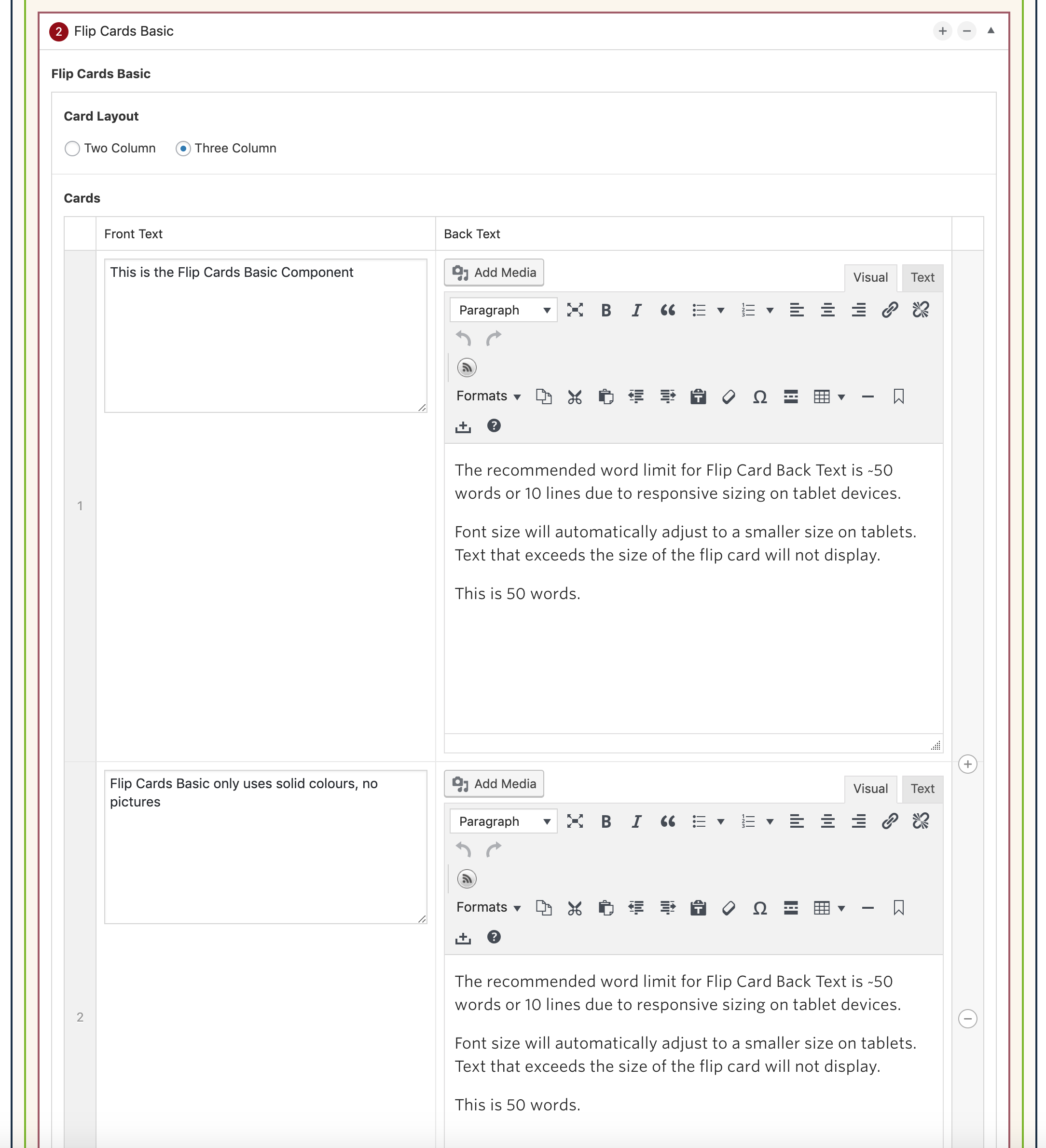
Component Fields:
Each Flip Cards Basic text box consists of and Front Text and Back Text fields.
Interactivity:
Each card ‘flips’ horizontally on its Y-axis on mouse hover. Only one Flip Card may be open at a time.
Mobile/Tablet:
When viewed on mobile devices, this component will collapse into a dropdown accordion view. The text on the front of the Flip Card becomes the accordion heading title and the text on the back of the Flip Card forms the content within the accordion when opened.
On tablet view, the font size of the back text is reduced. The cards will flip when tapped rather than hover.
How to add a Flip Cards Basic component
- Add a Page Section.
- Click Add New Inside Content Row and select Single Column Row.
- Click Add Component button > select Flip Cards. (Please submit a ticket if you cannot find the option.)
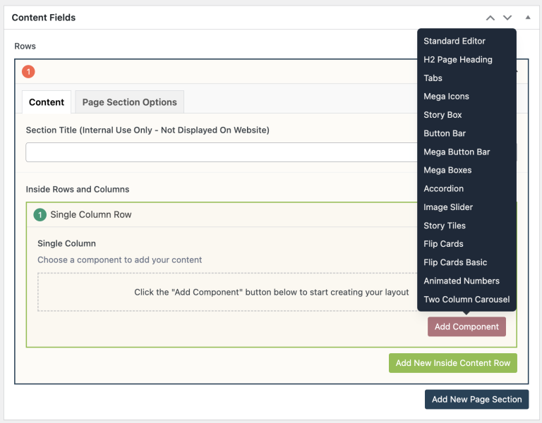
- Click Add Basic Flip Card button to add individual text boxes.
- At the top, select your desired Card Layout.
- Two Column – Two Flip Cards (50/50) in a single row.
- Three Column – Three Flip Cards (33/33/33) in a single row.
- Add your Front Text.
- Add your Back Text.
- Reorder your Basic Flip Cards by dragging and dropping each item to your desired order. Hover over the numbered grey bar on the far left to click and drag each item up or down.
- Click Preview to often to test your Flip Cards. Make edits as necessary.
- Publish/Update when ready to go live.

Do’s and Don’ts
- BE CONCISE. Space is limited inside the Flip Cards component. Fewer words in the text box allow for more flexibility on smaller mobile/tablet screens.
- Try to keep your word counts even between Flip Cards.
- The recommended word limit for Flip Card Back Text is ~50 words or 10 lines due to responsive sizing on tablet devices. Font size will automatically adjust to a smaller size on tablets. Text that exceeds the size of the flip card will not display.
- Test your Flip Cards often. Make sure you are writing concisely and leaving room at the bottom of each box.
- Flip Cards are very large. Consider using a different component if you have more than 6 cards to present.