Adding Buttons Inside Content
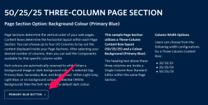
View live examples on the Demo Site > Requirements Buttons can be created within any Standard Editor component within the Faculty and Department theme. Recommended Usage Buttons are a common element in all websites. Use these to link to other pages within your site, or to other websites. How to use this component Highlight the […]
Story Box Component
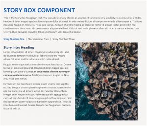
Live Example Requirements The Story Box component is available within a single column row on the Faculty and Department theme. Recommended Usage This is the Story Box Paragraph text. You can add as many stories as you like however we recommend a maximum of around four or five. It functions very similarly to a carousel […]
H2 Page Heading
Live example Requirements The H2 Page Heading component is available in the Single column row on the Faculty and Department theme. Recommended Usage Page heading or section heading used to introduce a section of content. How to use this component Add a single column row to a page section Click Add Component Click H2 […]
Tabs Component
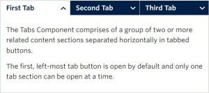
Live example Requirements The tabs component is available in each of the column layout options on the Faculty and Department theme: Single column row Two column row Recommended Usage The Tabs Component comprises of a group of two or more related content sections separated horizontally in tabbed buttons. The first, left-most tab button is open […]
Standard Editor Component
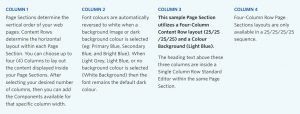
Live example (all paragraphs of text on this page) Requirements The standard editor component is available on each of the column layout options on the Faculty and Department theme: Single column row Two column row Three column row Four column row Recommended Usage Used to display text, and sometimes images. Text can be hyperlinked, made […]


