Requested by: Randy Lievers
Status: Completed
Requires a new CMS Component?: No
Requires New Functionality?: Yes
Estimated Completion Date: Completed - Early July 2019
Description
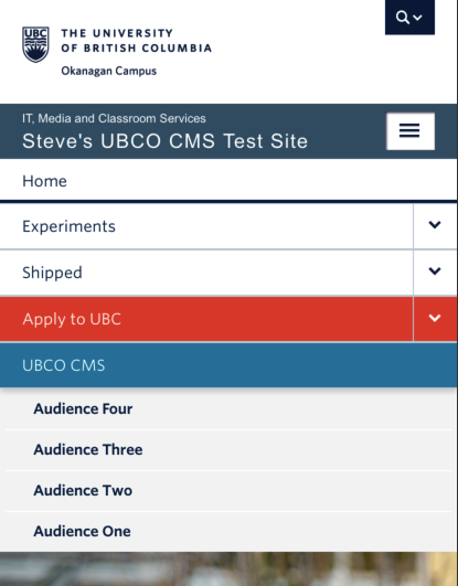
Audience Navigation needs to be fixed on mobile. It currently disappears on mobile.
Solution =
1) unhide audience menu at 768px media query
2) hide when menu is inactive (this is as per Steve’s lingo at the drop-in of March 6).
[Update: 100% CSS options are too limited. SQ researching possible jQuery solutions and/or rewriting PHP menus in theme. ]
[Update 2: Better solution developed of adding Audience Page Menu Items in primary menu, then adding .hidden-tablet and .hidden-desktop classes to each respective audience menu item. Idea emerged from a very productive brainstorm between IT and Student Services. This method is 100% GUI and does not require changes to header.php, jQuery, or any new CSS.]
[Update 3: IT will apply this retroactively on current sites using audience menus and will be made part of IT’s initial build steps for menu configuration for new Content Starter Packs.]
[Update 4: IT updated all live Faculty/dept theme sites using the audience menus/secondary menu in early July]
Ticket Number: N/A
Media (Screenshots, etc.)
