Requirements
- Applied to Child Theme for ok.ubc.ca;
Recommended Usage
The Tabbed Story Tiles component offers an engaging way to present stories by showcasing images alongside titles in a tabbed format. This design not only enhances visual appeal but also improves usability, allowing users to easily navigate and explore different stories with a clear visual cue provided by each tab. By utilizing Tabbed Story Tiles, we create a more interactive and organized experience that encourages users to delve deeper into our content, ultimately enhancing user engagement and satisfaction.
Component Fields:
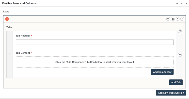
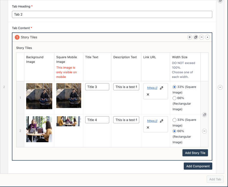
The Tabbed Story Tiles have the following fields:
- Tab Heading – Required.
- Add Component – Required; this creates a NEW row of story tiles.
- Add Tab – Optional; the maximum number of tabs is TWO.
Mobile/Tablet:
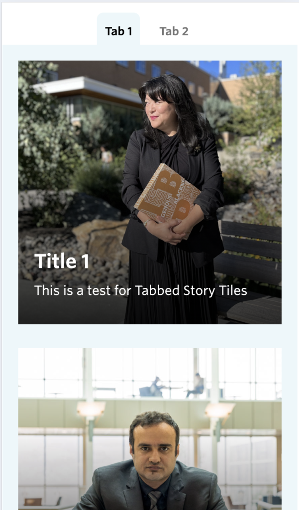
The Tabbed Story Tiles do not collapse headings into accordions on mobile devices by design; instead, each story tile stacks vertically for improved readability and usability.
How to add a Tabbed Story Tiles component:
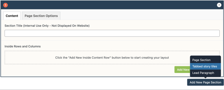
- Add a new Page Section.
- Click Tabbed story tiles.
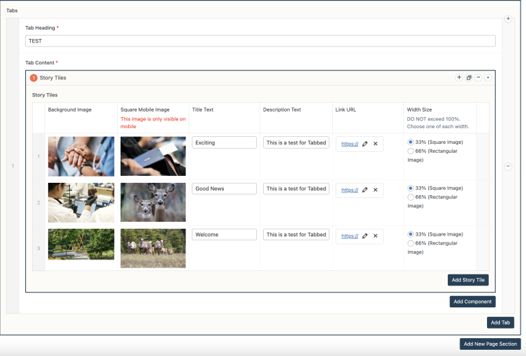
- Input Tab Heading.
- Click Add Component.
- Add Story Tile;
Note: Ensure that the total width of the story tile does not exceed 100%. For instance, you can achieve this by using 3 story tiles, each occupying 33% of the width, or 2 story tiles with widths of 33% and 66% respectively. When selecting a width of 33%, please use square images for the background, and for a width of 66%, use rectangle images.
- Optional; click Add Component again to add another row of story tiles.
- Optional; click Add Tab and Add Story Tile for the second tab.
Note: Since the maximum number of tabs is TWO, the “Add Tab” button in grey will prevent you from adding another tab.
Do’s and Don’ts
- BE CONCISE.
- Each square or rectangular image should be uniform in size.
- Ensure that the total width of the story tile does not exceed 100%.
- Each row of story tiles should have similarly themed content.
- Like every other component, do not overuse Tabbed Story Tiles.
