Example Mega Boxes – View live example on our Demo Site
Requirements
Single Column, Two Column, and Three Column Layout Rows on the Default, Home, Landing and the News page templates within the Faculty and Department theme.
Recommended Usage
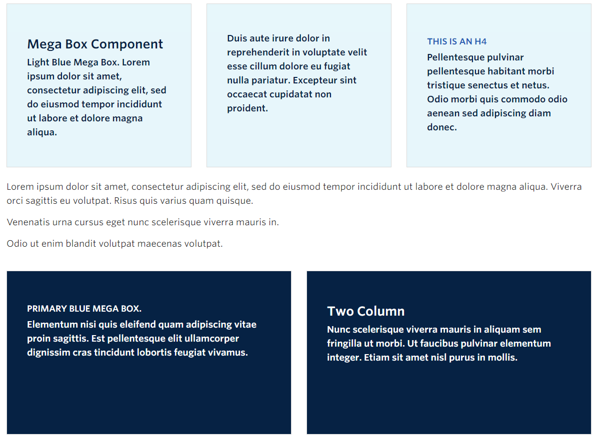
The Mega Box component consists of boxed areas with text inside, grouped together in sets of two-column or three-column rows. There are four colour options, Primary (dark blue), Secondary (medium blue), Light Blue, and White. Mega boxes are best used for displaying themed or grouped content, and should be similar in word or character length as each box grows to the height of the tallest one in the group.
Component Fields:
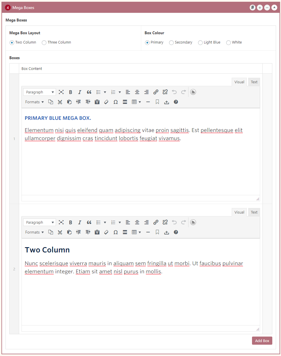
Mega Boxes have the following fields:
- Mega Box Layout – Mega boxes can be displayed in two or three columns.
- Box Colour – Available button colours are UBC Primary (dark blue), Secondary (medium blue), Light Blue, and White.
- Box Content – Standard WYSIWYG editor without add media button.
Mobile/Tablet:
On mobile devices, the boxes will stack vertically.
How to add a Mega Box component in a Single Column Row:
- Add a Page Section.
- Click Add New Inside Content Row and select Single Column Row.
- Click Add Component button > select Mega Boxes.
- Choose the component options first. Mega Boxes have two layout options, and four colour options.
- Click Add Box button to add individual boxes..
- Add content to each box.
- Optional: Reorder individual boxes by dragging and dropping each box to your desired order. Hover over the numbered grey bar on the far left to click and drag each box up or down.
- Click Preview to often see how your page looks before going live. Make edits as necessary.
- Publish/Update when ready to go live.
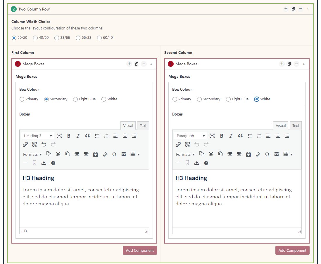
How to add a Mega Box component in a Two or Three Column Row:
- Add a Page Section.
- Click Add New Inside Content Row and select Two or Three Column Row.
- Click Add Component button > select Mega Boxes.
- Choose a colour option. Mega Boxes in the Two and Three Column option have four colour options.
- Click Add Box button to add individual boxes..
- Add content to each box.
- Click Preview to often see how your page looks before going live. Make edits as necessary.
- Publish/Update when ready to go live.
Do’s and Don’ts
- BE CONCISE.
- Content in each box should be of similar length.
- Do not add images inside the boxes.
- Each group of boxes should have similarly themed content.
- Like every other component, do not overuse mega boxes.