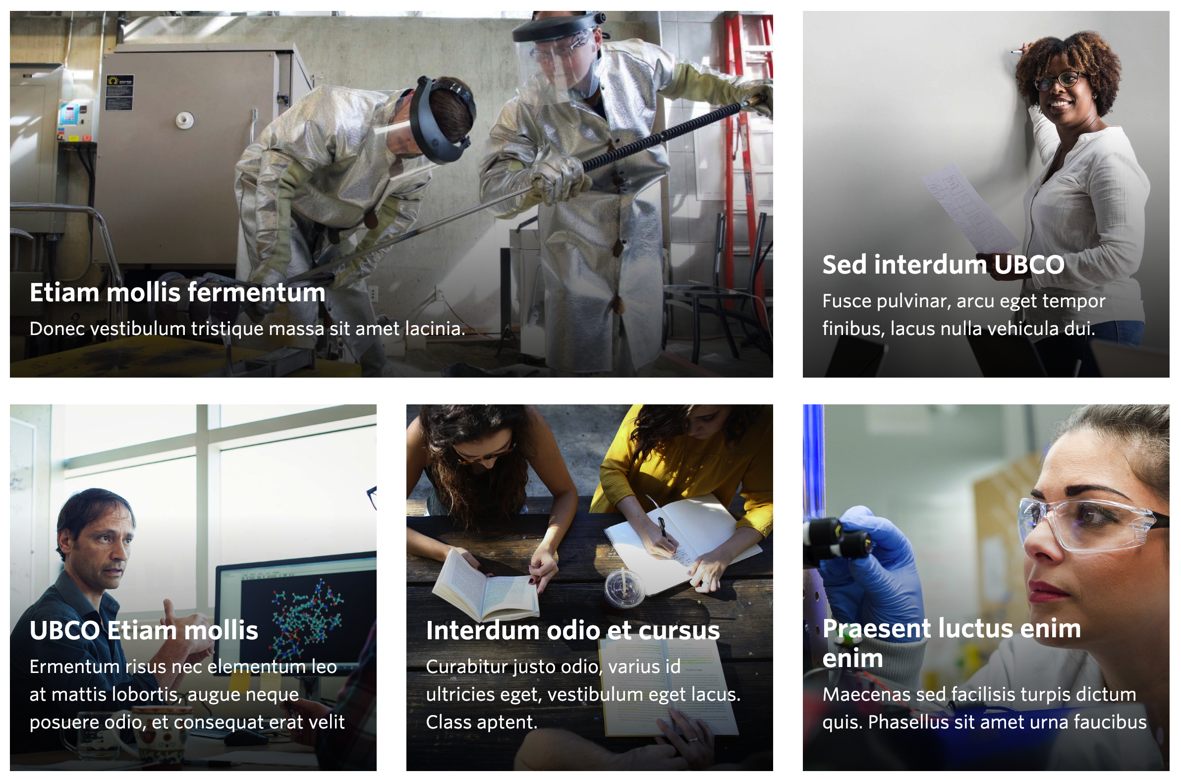
Example Story Tile Component. View in live Demo Site >
Recommended Usage
Story Tiles are a set of large square and rectangular image buttons displayed in rows. They look best when used in multiple rows to add visual interest to a page.
Component Fields:
Each Story Tile consists of a Background Image, Title Text, Description Text, and a Link URL field.
Interactivity:
The images inside the Story Tile component have a ‘zoom in’ effect when hovered over by a mouse cursor. Story Tiles can be linked to a set of featured stories.
Mobile/Tablet:
When viewed on mobile devices, this component will stack each tile top-to-bottom. Desktop view orders the tiles from left-to-right.
How to add a Story Tile component
- Add a Page Section.
- Click Add New Inside Content Row and select Single Column Row.
- Click Add Component button > select Story Tiles. (Please submit a ticket if you cannot find the option.)
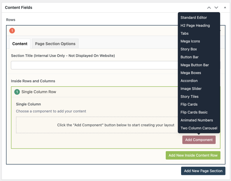
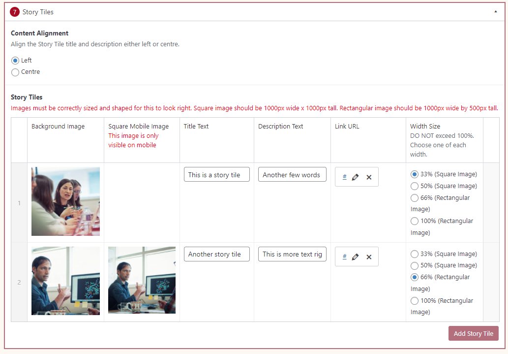
- Choose a Content Alignment option.
- Click Add Story Tile button to add individual Story Tiles.
- On the far right column, select your desired Width Size.
- NOTE: Any single row should not exceed 100%.
- Add a Background Image.
- Add your Title Text.
- Add your Description Text.
- Add your Link URL.
- Reorder your Story Tiles by dragging and dropping each tile to your desired order. Hover over the numbered grey bar on the far left to click and drag each tile up or down.
- Click Preview to often to test your Story Tile. Make edits as necessary.
- Publish/Update when ready to go live.

Do’s and Don’ts
- Do use Story Tiles to link to interesting stories and features in your site.
- Don’t use Story Tiles to force users to browse your website with Story Tiles as the primary way to navigate.
- Story Tiles automatically add a dark gradient at the bottom of the tiles. Avoid using dark images with this component.
- When using the Rectangular Story Tile, don’t forget to add a square version of your image to load on mobile devices.
Availability
This component is available in the Single column row on the Faculty and Department theme.