Example Button Bar – View in live Demo Site >
Requirements
Single Column Row and Two Column Rows on the Default, Home, Landing and the News page templates within the Faculty and Department theme.
Recommended Usage
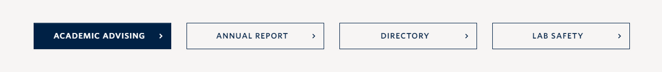
The Button bar component is a series of buttons grouped together on a single line. Users can select rows with 1-4 buttons in the Button Bar and can add multiple rows of Button Bars. These are best for displaying related action items that are all related to a section or page’s content.
Component Fields:
Button Bar has the following fields;
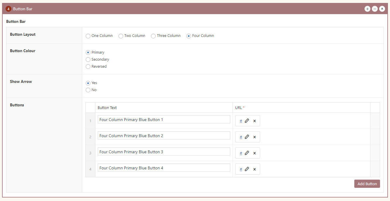
Button Layout – Button bar can be displayed in One, Two, Three or Four columns.
Button Colour – Button bar can have the Primary or Secondary colour schemes. Button Bar buttons will automatically reverse to white when placed on an image background or dark background colour option (Primary, Secondary, and Bright Blue).
Show Arrow – to either show or hide the arrow icon.
Buttons/Add Button – to add buttons – there are fields to enter the label and the link.
Interactivity:
Button Bars have a ‘background colour’ style/rule when hovered over by a mouse cursor. They will maintain the size to the width of the column regardless of the amount of text inside.
Mobile/Tablet:
When viewed on mobile devices, this component will stack buttons vertically top-to-bottom from the initial order.
How to add a Button Bar component
- Posts/Pages -> Add New -> Add a Page Section.
- Click Add New Inside Content Row and select Single Column Row/Two Column Row.
- Click Add Component button -> select Button Bar.
- Choose the component options first. Button bar has four layout options, one, two, three and four column. Choose a colour scheme and enable or disable the arrow.
- Click Add Button button to add individual buttons.
- Add your Button Text.
- Add your Link URL.
- Reorder individual buttons by dragging and dropping each button to your desired order. Hover over the numbered grey bar on the far left to click and drag each button up or down.
- Click Preview to often test your button bar. Make edits as necessary.
- Publish/Update when ready to go live.
Button Bar Component in Page Editor
Do’s and Don’ts
- Use Button Bars to link to related resources or action items featured in a specific section or page.
- BE CONCISE – Use button labels that clearly explain what each button does.
- Like every other component, avoid using too many buttons.
- Try not to use Button bars at the start of a page, because it could take users away from the page even before they go through the contents.
- If linking to external pages or websites, make sure to check the ‘open link in a new tab’ option.