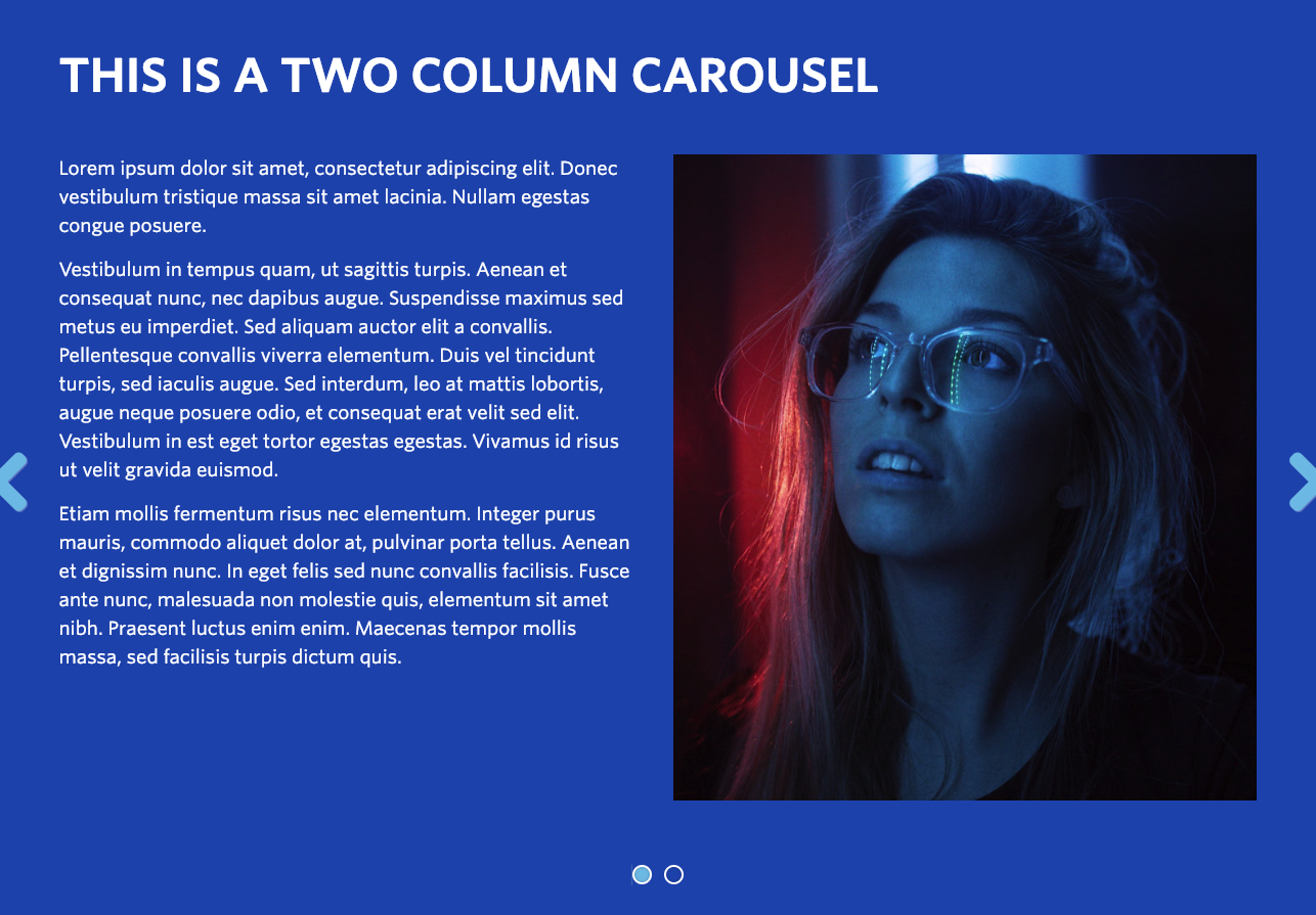
Example Two Column Carousel. View in live Demo Site >
Requirements
This component is available in the Single column row on the Faculty and Department theme.
Recommended Usage
The Two Column Carousel component displays a large, two-column section of text and imagery in a slide carousel. This component is best used with an image inside one column and text on the other side. Typical use for this component would be displaying a series of student testimonials or faculty profiles. It would also be good for featuring events and workshops or promoting specific research projects.
Component Fields:
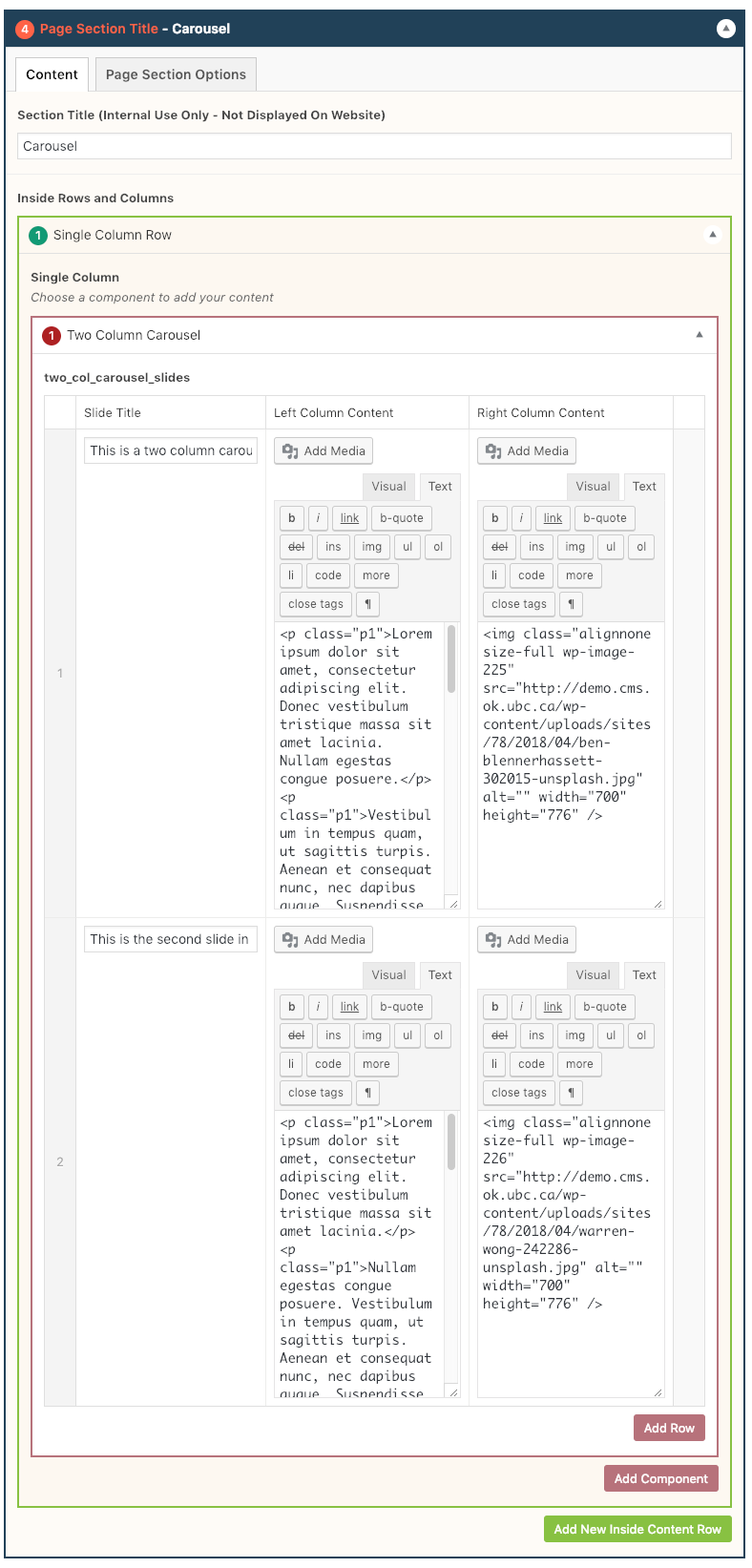
Each Two Column Carousel component consists of a Slide Title, Left Column Content, and Right Column Content.
Interactivity:
Users can browse between carousel stories using arrows on the far left and right side of the page section. The carousel will slide every 5 seconds.
Mobile/Tablet:
When viewed on mobile devices, the columns will stack on top of one another from the left-right order to top-bottom. The arrows disappear and indicator dots show on mobile devices.
How to add a Two Column component
- Add a Page Section.
- Click Add New Inside Content Row and select Single Column Row.
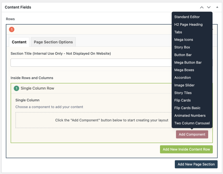
- Click Add Component button > select Two Column Carousel. (Please submit a ticket if you cannot find the option.)

- Click Add Row button to add individual text boxes.
- Add your Slide Title.
- Add your Left Column Content.
- Add your Right Column Content.
- Reorder your Carousel Slides by dragging and dropping each item to your desired order. Hover over the numbered grey bar on the far left to click and drag each item up or down.
- Click Preview to often to test your Two Column Carousel. Make edits as necessary.
- Publish/Update when ready to go live.

Do’s and Don’ts
- Try to keep your content and image approximately the same height as the content will flow better on tablet devices.
- Choose a consistent orientation for your images. For example, crop all images to squares or portrait orientation. Additionally, try to keep the images consistently in the left column and text on the right or vice versa.