Example Accordion – View in live Demo Site
Requirements
Single Column Row and Two Column Row on the Default, Home, Landing and the News page templates within the Faculty and Department theme.
Recommended Usage
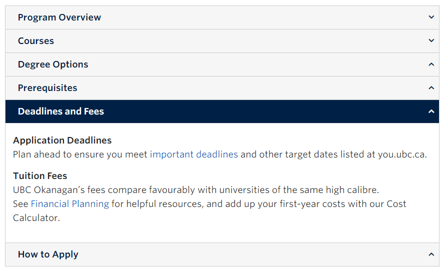
Accordions are useful when you want to hide and show a large amount of content. Each item can be “expanded” or “collapsed” to reveal the content associated with that item.
Component Fields:
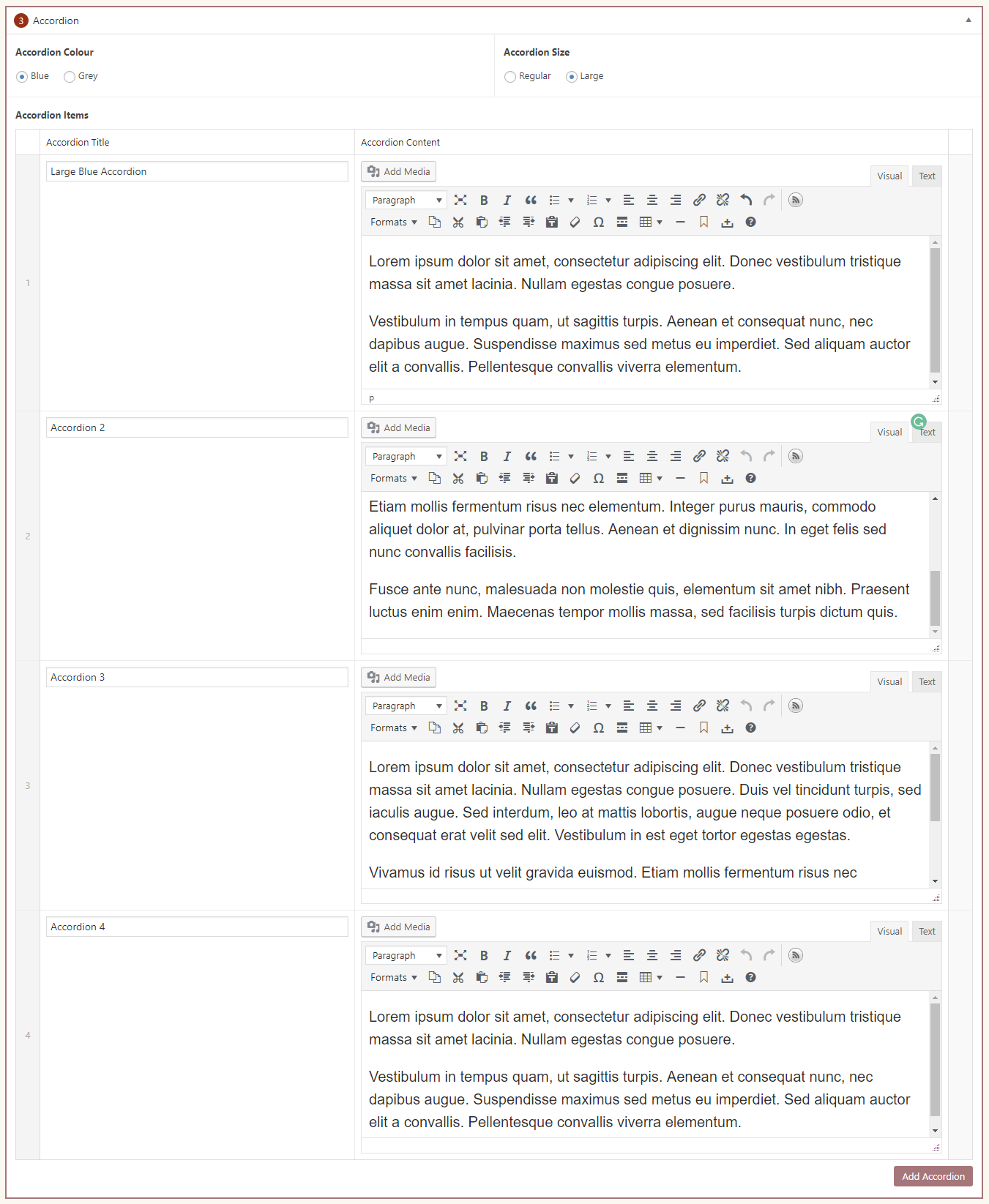
Each accordion consists of a Title and Content field and the accordion component has a colour scheme and size option.
Interactivity:
Each accordion toggle between hiding and showing the content contained. An active/expanded accordions title will have a different background colour.
Mobile/Tablet:
On mobile devices, the buttons will stack vertically as it’s own full-width button row, so it’s best to use this component sparingly.
How to add an Accordion component
- Posts/Pages -> Add New -> Add a Page Section.
- Click Add New Inside Content Row and select Single Column Row/Two Column Row.
- Click Add Component button -> select Accordion.
- Choose the colour and size.
- Click Add Accordion button to add individual accordions.
- Add your Accordion Title and Content.
- Reorder individual accordions by dragging and dropping each accordion to your desired order. Hover over the numbered grey bar on the far left to click and drag each accordion up or down.
- Click Preview to often test your accordion. Make edits as necessary.
- Publish/Update when ready to go live.
Do’s and Don’ts
- Useful when you want to toggle between hiding and showing a large amount of content.
- Accordions should be used for presenting support information and not for key information.
- Don’t use accordions for hiding just one sentence.
- Avoid having pictures or videos inside an accordion.