
Example Mega Button Bar – View in live Demo Site >
Requirements
Single Column Row on the Default, Home, Landing and the News page templates within the Faculty and Department theme.
Recommended Usage
The Mega Button bar component consists of large buttons grouped together in sets of two-column or three-column rows. Each button has a title, optional button text, and a URL. Like Button bar, these are best for displaying related action items that are all related to a section or page’s content.
Component Fields:
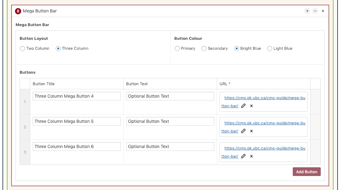
Mega Button Bar has the following fields;
Button Layout – Mega Button Bar can be displayed in One or Two Columns.
Button Colour – Available button colours are UBC Primary Blue, Secondary Blue, Bright Blue, and Light Blue. Each colour has a slight linear gradient background colour.
Buttons/Add Button – to add buttons – there are fields to enter the title, optional text and the link.
Interactivity:
Mega Button Bars have a slight linear gradient background colour style/rule when hovered over by a mouse cursor.
Mobile/Tablet:
On mobile devices, the buttons will stack vertically as it’s own full-width button row, so it’s best to use this component sparingly.
How to add a Mega Button Bar component
- Posts/Pages -> Add New -> Add a Page Section.
- Click Add New Inside Content Row and select Single Column Row.
- Click Add Component button -> select Mega Button Bar.
- Choose the component options first. Mega Button bar has two layout options, one and two column and then choose a colour scheme.
- Click Add Button button to add individual buttons.
- Add your Button Title and Text(Optional).
- Add your Link URL.
- Reorder individual buttons by dragging and dropping each button to your desired order. Hover over the numbered grey bar on the far left to click and drag each button up or down.
- Click Preview to often test your button bar. Make edits as necessary.
- Publish/Update when ready to go live.
Do’s and Don’ts
- BE CONCISE.
- Mega Buttons are best used as major external links at the bottom of pages and look great in sets of four and six.
- Use Mega Button Bars to link to related resources pertaining to content in a specific section or page.
- Like every other component, do not overuse mega button bars.
- If linking to external pages or websites, make sure to check the ‘open link in a new tab’ option.