
Example Call Out. View in live Demo Site >
Requirements
This component is available in the Single column row on the Faculty and Department theme.
Recommended Usage
A Call-Out Section makes it easy to highlight important information. It makes your content stand out with a visually distinct box for text and links. The call-out section is not a component, instead is a page section that has a background colour. The contents of a call-out section are populated using the Standard Editor Component which is placed inside a single column row.
How to add a call-out
- Add a Page Section.
- In Page Section Options, Choose Colour Background under Background Type
- Choose a background from Background and Text Colour options.
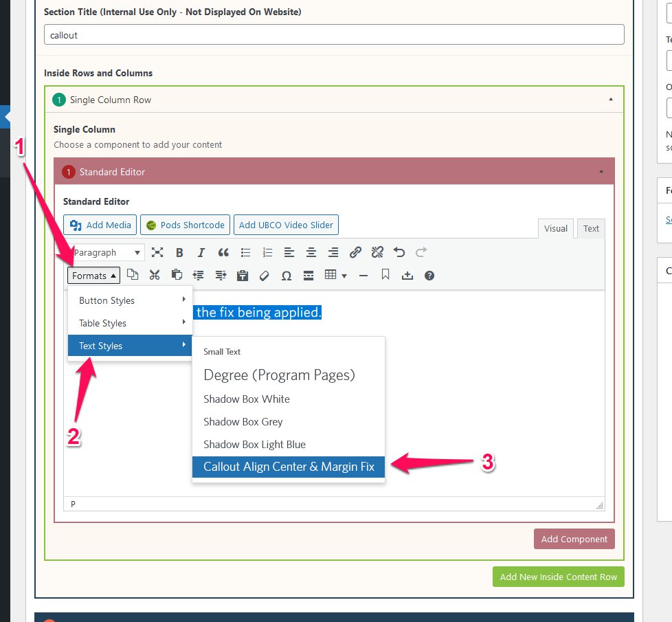
- Switch back to the Content tab
- Click Add New Inside Content Row and select Single Column Row.
- Click Add Standard Editor and enter your call-out message along with the link.
- Highlight the text
- Click the “Formats” button and select Text Styles and “Callout Align Center & Margin Fix”
- Click Preview to often to test your call-out. Make necessary edits to the Page Section Margin and Padding by going to the Page Section Options.
- Publish/Update when ready to go live.
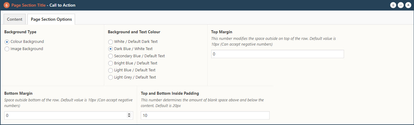
Page Section Options of a Call-out Section
Apply the callout style.
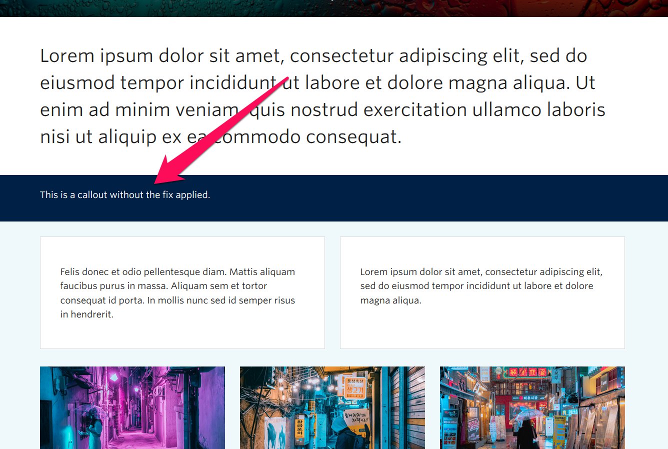
Screenshot showing page section without callout style selected
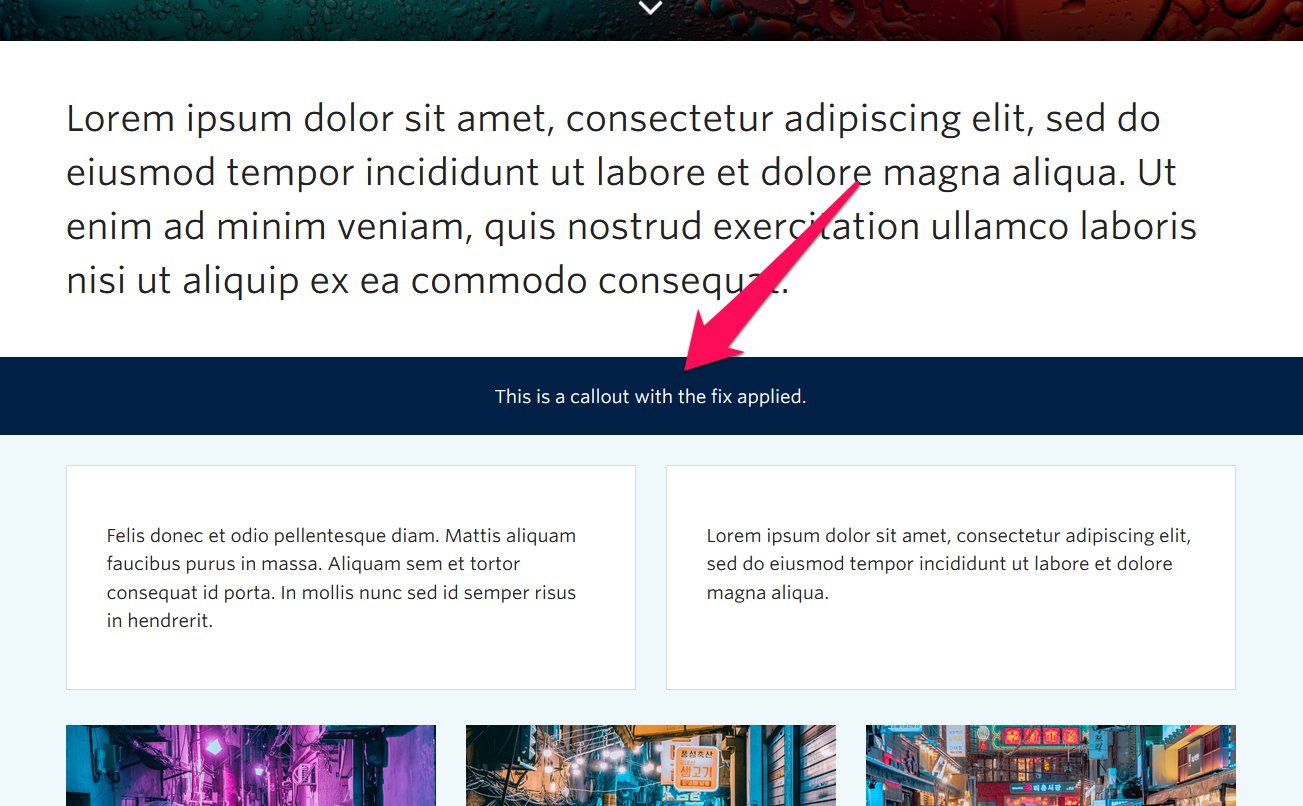
With callout style applied
Do’s and Don’ts
- BE CONCISE.
- Adding more than one line of text could potentially conflict with the concept of a typical call-out.
- Try keeping the content restricted to one clear call to action (CTA) with a link.
- Avoid using the words “Click Here” for any link you add to a call-out.